003 / Work
Seba
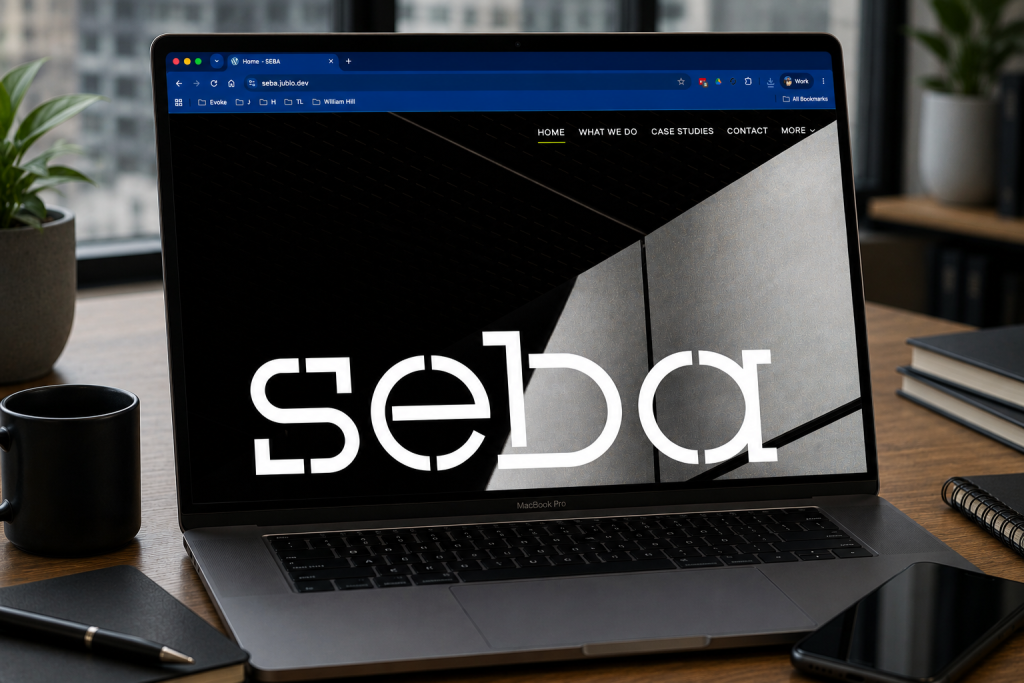
A brand-led web experience for an M&E contractor working across commercial, healthcare, education and public-sector environments.
The work
Built around
the system.
The project needed to feel established and confident without falling into the visual language of a generic construction template.
A contractor site that does not look like every contractor site.
Seba needed a digital presence that reflected the quality and confidence of the work without overcomplicating the message. The positioning centres on trust, pride in the detail and a straightforward route for prospective clients to make contact.
The visual system deliberately avoids the usual catalogue of stock hard-hat imagery and lets typography, project photography and disciplined colour do the heavy lifting.
Simple, architectural and direct.
The layout is intentionally restrained: large type, generous space, strong green brand colour and a structure that works equally well on a desktop in an office or a phone on site.
The result feels more like the business it represents — practical, considered and confident — rather than a theme with a logo dropped into it.
The boring bits still matter.
Responsive behaviour, accessible forms, sensible performance, anti-spam protection and search-friendly structure were treated as part of the design rather than post-launch housekeeping.
Next / Start something
Got something
interesting?
Software, hardware, infrastructure or something in between.
[email protected] ↗