004 / Work
Pierre Angulaire
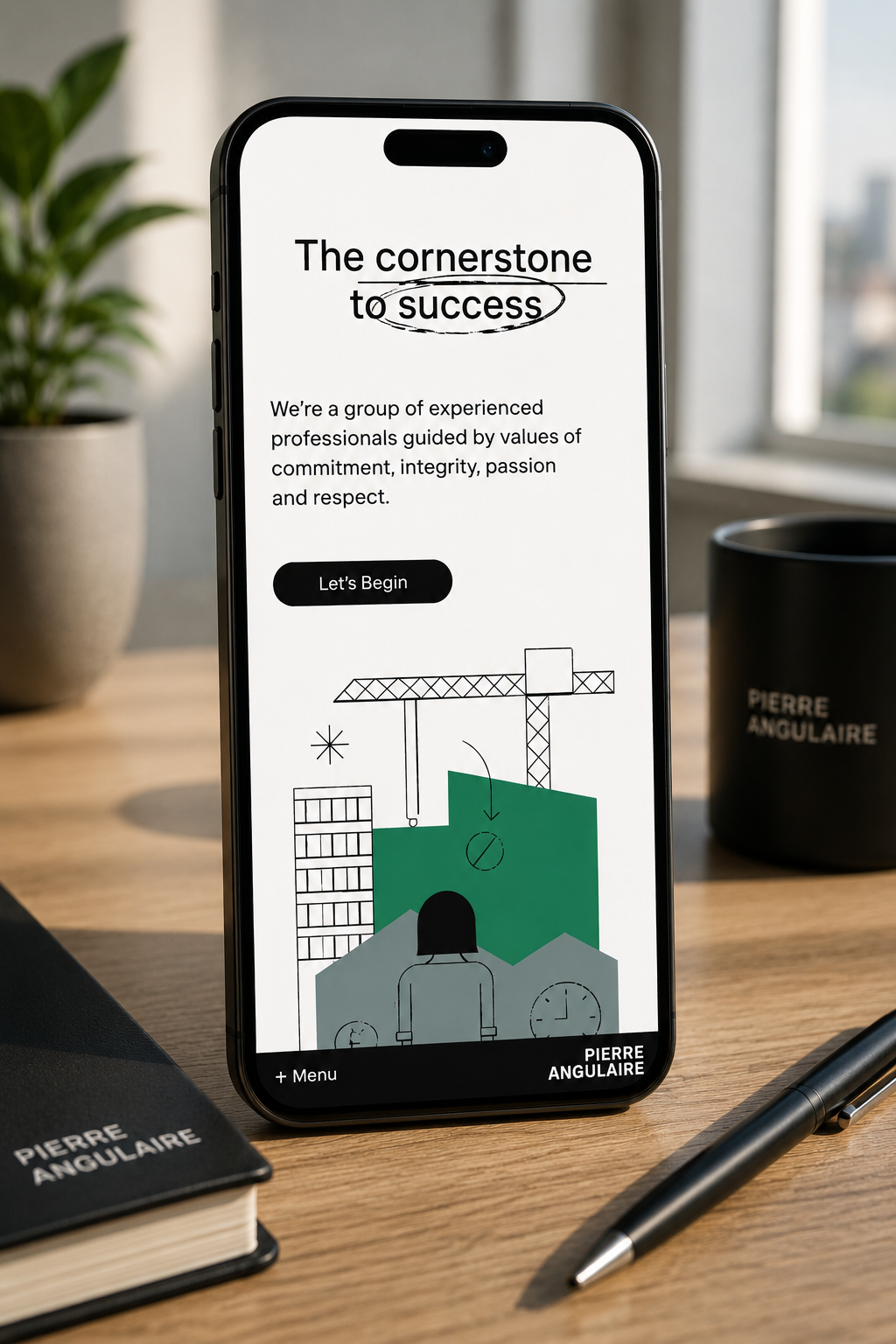
A mobile-first digital experience with a strong editorial identity and unusually graphic presentation.
The work
Built around
the system.
The challenge was to preserve that character in a responsive implementation without turning the site into a heavy interactive demo.
Keep the character. Lose the friction.
Strong art direction can easily become a technical excuse for a slow or awkward website. The aim was to retain the oversized typography, image-led composition and editorial feel while making the experience behave naturally on a small screen.
That meant treating mobile as the primary canvas rather than a compressed version of a desktop layout.
Graphic without being heavy.
The implementation focuses on layout, typography and responsive image treatment instead of leaning on heavyweight animation or unnecessary client-side behaviour.
The result keeps the visual confidence of the concept while remaining direct, fast and easy to navigate.
Interaction that supports the design.
Spacing, scale, crop and transition behaviour are tuned around touch-sized screens, where small implementation decisions have a disproportionate effect on how polished the final product feels.
Next / Start something
Got something
interesting?
Software, hardware, infrastructure or something in between.
[email protected] ↗